Android的Drawable
BitmapDrawable
BitmapDrawable
以**`**作为根节点: 1
2
3
4
5
6
7
8
9
10bitmap
|- src="@drawable/res_id"
|- antialias="[true | false]"
|- dither="[true | false]"
|- filter="[true | false]"
|- tileMode="[disabled | clamp | repeat | mirror]"
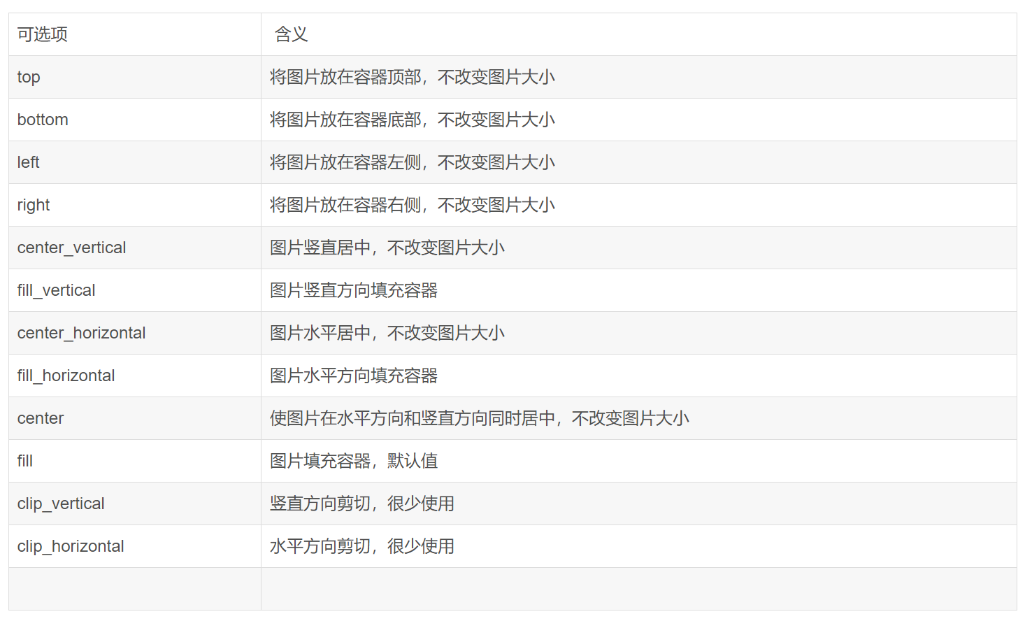
|- gravity="[top | bottom | left | right | center_vertical |
| fill_vertical | center_horizontal | fill_horizontal |
| center | fill | clip_vertical | clip_horizontal]"
|属性:
- src:表示该 BitmapDrawable 引用的位图,该图片为 png、jpg 或者 gif;
- antialias:表示是否开启抗锯齿,开启后使图片更加光滑,应该开启
- dither:表示当位图和屏幕的像素配置不同时,是否允许抖动,开启后高质量图片在低质量屏幕上仍可以保持较好的显示效果,比如一张位图的像素为 ARGB_8888 32 位色,而屏幕像素为 RGB_565;一般应该开启
- filter:是否允许为位图进行滤波以获取平滑的缩放效果;一般应该开启
- gravity:定义位图的 gravity,当位图小于容器时,该属性指定了位图在容器中的停靠位置和绘制方式。
- tileMode:表示当位图小于容器时,执行“平铺”模式,并且指定铺砖的方法。该属性覆盖 gravity 属性——当指定了该属性后,gravity 属性即使设置了,也将不起作用。
ShapeDrawable
通过颜色构造的图形既可以是纯色也可以是具有渐变效果的:
1
2
3
4
5
6
7
8
9
10
11
12
13
14
15
16
17
18
19
20
21
22
23
24
25
26<shape
xmlns:android="http://schemas.android.com/apk/res/android"
android:shape="rectangle">
<corners android:radius="5dp"/>
<gradient
android:angle="90"
android:endColor="#ddd"
android:startColor="#343434"
android:type="linear"/>
<padding
android:left="integer"
android:top="integer"
android:right="integer"
android:bottom="integer"/>
<size
android:width="integer"
android:height="integer"/>
<solid
android:color="color"/>
<stroke
android:width="2dp"
android:color="#00f"/>
</shape>shape标签创建的Drawable其实体类实际上是GradientDrawable
属性:
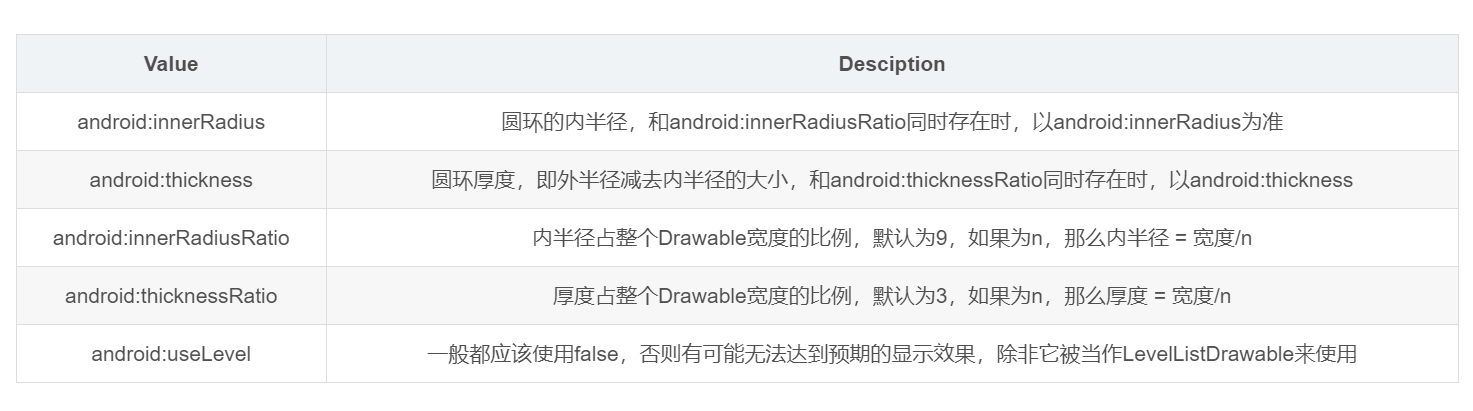
android: shape:有4个选项,rectangle(矩形)oval(椭圆)line(横线)ring(圆环),默认为rectangle,需要注意line和ring需要通过标签来指定线的宽度和颜色等信息,否则无法达到预期效果,针对ring这个形状有五个特殊属性:
< corners>:
它只适用于矩形shape,表示矩形四个角的圆角程度,用px来表示,它有5个属性:
- android:radius—— 给四个角设置相同的角度,优先级较低,会被其他四个属性覆盖
- android:bottomLeftRadius——设定左下角的角度
- android:bottomRightRadius——设定右下角的角度
- android:TopLeftRadius——设定左上角的角度
- android:TopRightRadius——设定右上角的角度
< gradient>:
它与标签
是相互排斥的,其中solid表示纯色填充,而gradient表示渐变效果。它有如下几个属性: - android:centerX——渐变的中心点横坐标
- android:centerY——渐变的中心点纵坐标
- android: startColor——渐变的起始颜色
- android:centerColor——渐变的中间颜色
- android:endColor——渐变的结束颜色
- android:gradientRadiu——渐变半径,仅当android:type=”radial”时有效
- android:useLevel——一般为false,当Drawable作为StateListDrawable使用时为false
- android:type——渐变的类别,有linear(线性渐变)、radial(径向渐变)、sweep(扫描线渐变)三种,默认值为linear
- android:angle——渐变的角度,默认为0,其值必须是45的倍数,0表示从左到右,90表示从下到上。
**< solid>:**表示纯色填充,通过android:color即可指定填充的颜色
< stroke>:
- android:color——描边的颜色
- android:width——描边的宽度,越大则shape的边缘线越粗
- android:dashWidth——组成虚线的线段的宽度
- android:dashGap——组成虚线的线段之间的间隔
需要注意:如果android:dashWidth和ndroid:dashGap有任何一个为0,那么虚线效果将不能生效
**
:**表示包含它的View的空白 **< size>:**指shape的大小,一般不会用到。
LayerDrawable
LayerDrawable内部包含了一组Drawable,系统会按照这些Drawable对象的数组顺序来绘制他们,索引越大的Drawable将会被绘制的越上面。(简单一句话, 这些Drawable将会按顺序层叠在一起)。
LayerDrawable对象的xml文件的根元素是<layer-list>, 该元素内部包含多个<item>。item标签内部可以指定drawable、id和位置相关属性。
1 | <layer-list> |
StateListDrawable
这个是开发中最常用的类型,
StateListDrawable以**<selector>**作为根节点:1
2
3
4
5
6
7
8
9
10
11
12
13selector
|- item
| |- drawable="@drawable/drawable_id"
| |- state_pressed="[true | false]"
| |- state_focused="[true | false]"
| |- state_selected="[true | false]"
| |- state_hovered="[true | false]"
| |- state_checked="[true | false]"
| |- state_checkable="[true | false]"
| |- state_enabled="[true | false]"
| |- state_activated="[true | false]"
| |- state_window_focused="[true | false]"
|一个
selector以多个item来组成,每个 item 由 0 个或者多个状态和一个 drawable 来表示,当控件的状态变化后,将根据控件当前的状态,来进行匹配,匹配一个最适合当前状态的 item,然后用这个 item 的 drawable 来进行绘制。比如,我们一个普通按钮的 selector 如下:1
2
3
4
5
6
7<selector xmlns:android="http://schemas.android.com/apk/res/android">
<item
android:state_pressed="true"
android:drawable="@drawable/pressed_btn" />
<item android:drawable="@drawable/normal_btn" />
</selector>颜色也可以通过状态控制如下:
1
2
3
4<selector xmlns:android="http://schemas.android.com/apk/res/android">
<item android:state_pressed="true" android:color="#fff"/>
<item android:color="#e22"/>
</selector>
LevelListDrawable
LevelListDrawable对应于标签,它同样表示一个Drawable集合,集合中每个Drawable都有一个等级(level)的概念。根据不通的等级,LevelListDrawable会显示对应的Drawable
1 |
|
1 | var count = 0 |
TransitionDrawable
从Drawable的类继承图上可以看到TransitionDrawable是LayerDrawable的子类,但是不像LayerDrawable可以有多层drawable,TransitionDrawable只能管理两层drawable,并且提供了一个透明度变化的动画,可以控制从一层drawable过度到另外一层drawable的渐变动画效果。
1 |
|
1 |
|
可以使用startTransition和reverseTransition方法来接入实现淡入淡出效果
1 | ImageView mImageView = (ImageView) findViewById(R.id.imageview); |
InsetDrawable
InsetDrawable 表示一个drawable根据指定的距离嵌入到另外一个drawable内部。(我们看到的其实还是同一张图片,只是会空出一些边距)当控件需要的背景比实际的边框小的时候比较适合使用InsetDrawable。
很像drawable的padding属性,区别在于 padding表示drawable的内容与drawable本身的边距,insetDrawable表示两个drawable和容器之间的边距。
1 | <inset> |
1 |
|
ScaleDrawable
介绍:
- ScaleDrawable对应
标签,主要基于当前的level,对指定的Drawable进行缩放操作。 - 有点需要特别注意的是我们如果定义好了ScaleDrawable,要将其显示出来的话,必须给ScaleDrawable设置一个大于0小于10000的等级(级别越大Drawable显示得越大,等级为10000时就没有缩放效果了)
- ScaleDrawable对应
语法:
1 | <?xml version="1.0" encoding="utf-8"?> |
android:gravity
当图片小于容器尺寸时,设置此选项可以对图片经典定位,这个属性比较多,不同选项可以使用‘|’来组合使用。
android:scaleHeight
表示Drawable的高的缩放比例,值越大,内部Drawable的高度显示得越小,例如android:scaleHeight=”70%”,那么显示时Drawable的高度只有原来的30%。
android:scaleWidth
表示Drawable的宽的缩放比例,值越大,内部Drawable的宽显示得越小,例如android:scaleWidth=”70%”,那么显示时Drawable的宽度只有原来的30%。
必须在代码中调用设置level(默认为0)的代码才可以正常显示:
1
2
3
4
5
6ImageView scaleImage= (ImageView) findViewById(R.id.scaleImage);
ScaleDrawable scale= (ScaleDrawable) scaleImage.getBackground();
scale.setLevel(1);
ClipDrawable
ClipDrawable 是对一个Drawable进行剪切操作,可以控制这个drawable的剪切区域,以及相相对于容器的对齐方式,Android中的进度条就是使用一个ClipDrawable实现效果的,它根据level的属性值,决定剪切区域的大小
ClipDrawable是根据level的大小控制图片剪切操作的 level的大小从0到10000,level为0时完全不显示,为10000时完全显示。是用Drawable提供的setLevel(int level)方法来设置剪切区域。
语法:
定义这是个ClipDrawable,必须作为根元素。 **属性:** xmlns:android
String类型。必须的,定义XML文件的命名空间,必须是 “http://schemas.android.com/apk/res/android“.
android:drawable
Drawable资源。 必须的。表示该ClipDrawable引用的drawable资源。
android:clipOrientation
关键字。 裁剪的方向。
android:gravity
关键字。指定从哪个地方裁剪。
必须是下面一个或多个值(多个值之间用“|”分隔):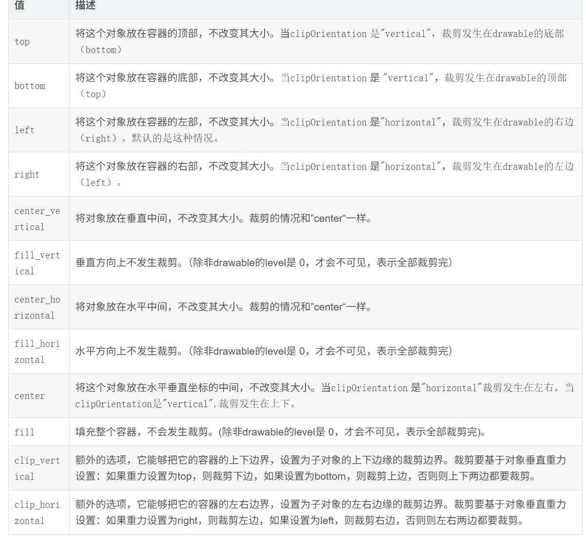
举例:
1
2
3
4
5
6
<clip xmlns:android="http://schemas.android.com/apk/res/android"
android:clipOrientation="horizontal"
android:drawable="@drawable/onepiece"
android:gravity="right"></clip>1
2
3
4
5
6<ImageView
android:id="@+id/clipimageview"
android:layout_width="match_parent"
android:layout_height="match_parent"
android:src="@drawable/clipdrawable"/>1
2
3
4
5
6
7
8
9
10
11ImageView imageView = (ImageView) findViewById(R.id.clipimageview);
final ClipDrawable clipDrawable = (ClipDrawable) imageView.getDrawable();
final Handler handler = new Handler(){
public void handleMessage(Message msg) {
if(msg.what == 0x123456){
clipDrawable.setLevel(clipDrawable.getLevel()+200);
}
}
};