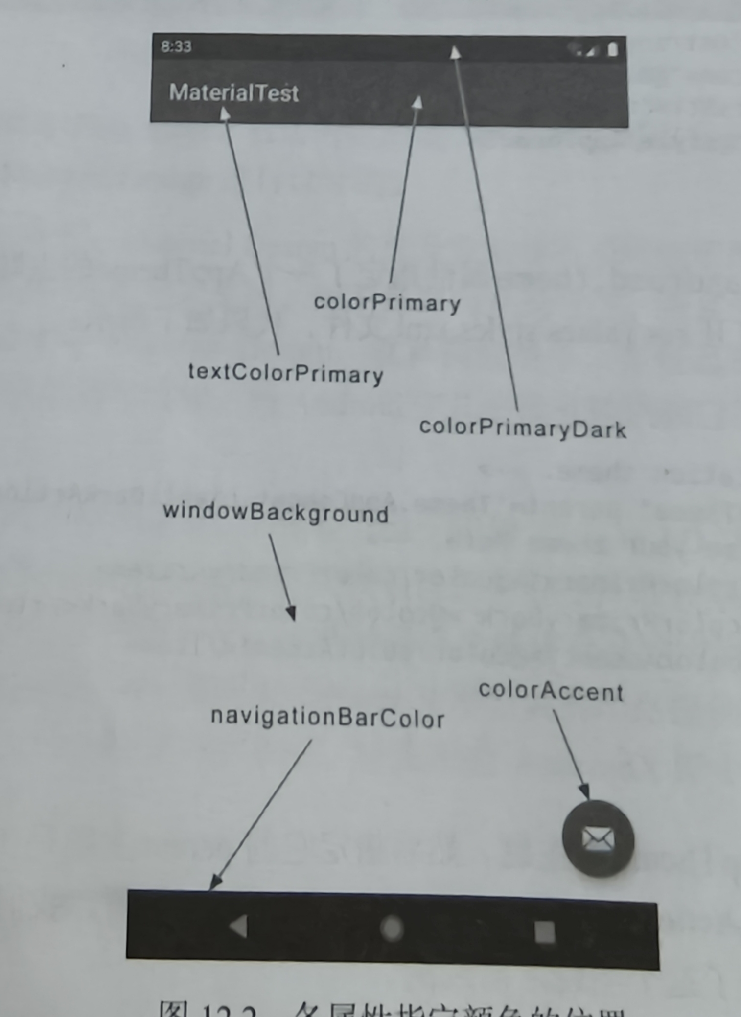
各版块颜色的代表标识
1
2
3
4
5
6
7
8
<androidx.appcompat.widget.Toolbar android:id="@+id/toolbar" android:layout_width="match_parent" android:layout_height="?attr/actionBarSize" android:background="?attr/colorPrimary" android:theme="@style/ThemeOverlay.AppCompat.Dark.ActionBar" app:popupTheme="@style/ThemeOverlay.AppCompat.Light" app:layout_scrollFlags="scroll|enterAlways|snap" />
1 setSupportActionBar(binding.toolbar)
DrawerLayout 这是一个布局,允许放入两个直接子控件,第一个是主屏幕显示的内容,第二个是滑动菜单中显示的内容
1
2
3
4
5
6
7
8
9
10
11
12
13
14
15
16
17
18
19
20
21
22
<androidx.drawerlayout.widget.DrawerLayout xmlns:android="http://schemas.android.com/apk/res/android" android:id="@+id/drawerLayout" android:layout_width="match_parent" android:layout_height="match_parent" > <FrameLayout android:layout_width="match_parent" android:layout_height="match_parent" > <androidx.appcompat.widget.Toolbar android:id="@+id/toolbar" android:layout_width="match_parent" android:layout_height="?attr/actionBarSize" android:background="@color/colorPrimary" android:theme="@style/ThemeOverlay.AppCompat.Dark.ActionBar" app:popupTheme="@style/ThemeOverlay.AppCompat.Light" app:layout_scrollFlags="scroll|enterAlways|snap" /> </FrameLayout> <TextView android:layout_width="match_parent" android:layout_height="match_parent" android:text="This is menu" /> </androidx.drawerlayout.widget.DrawerLayout>
1 2 3 4 5 6 7 supportActionBar?.let { it.setDisplayHomeAsUpEnabled(true ) it.setHomeAsUpIndicator(R.drawable.ic_menu) }
1 2 3 4 5 6 7 8 9 override fun onOptionsItemSelected (item: MenuItem ) Boolean { when (item.itemId){ android.R.id.home->binding.drawerLayout.openDrawer(GravityCompat.START) ... } return true }
NavigationView 作用: NavigationView 用于在侧滑菜单中显示导航菜单项,可方便地配置菜单资源、头部布局等。
依赖库
menu
headerLayout
点击事件
1 2 implementation("com.google.android.material:material:1.12.0" ) implementation("de.hdodenhof:circleimageview:3.1.0" )
1
2
3
4
5
6
7
8
9
10
11
12
13
14
15
16
17
18
19
20
21
22
23
24
25
26
<?xml version="1.0" encoding="utf-8" ?> <menu xmlns:android="http://schemas.android.com/apk/res/android" > <group android:checkableBehavior="single" > <item android:id="@+id/navCall" android:icon="@drawable/nav_call" android:title="Call" /> <item android:id="@+id/navFriends" android:icon="@drawable/nav_friends" android:title="Friends" /> <item android:id="@+id/navLocation" android:icon="@drawable/nav_location" android:title="Location" /> <item android:id="@+id/navMail" android:icon="@drawable/nav_mail" android:title="Mail" /> <item android:id="@+id/navTask" android:icon="@drawable/nav_task" android:title="Task" /> </group> </menu>
1
2
3
4
5
6
7
8
9
10
11
12
13
14
15
16
17
18
19
20
21
22
23
24
25
26
27
28
29
30
31
<?xml version="1.0" encoding="utf-8" ?> <RelativeLayout xmlns:android="http://schemas.android.com/apk/res/android" android:layout_width="match_parent" android:layout_height="180dp" android:padding="10dp" android:background="@color/colorPrimary" > <de.hdodenhof.circleimageview.CircleImageView android:id="@+id/iconImage" android:layout_width="70dp" android:layout_height="70dp" android:src="@drawable/nav_icon" android:layout_centerInParent="true" /> <TextView android:id="@+id/mailText" android:layout_width="wrap_content" android:layout_height="wrap_content" android:layout_alignParentBottom="true" android:text="buyu@qq.com" android:textColor="#FFF" android:textSize="14sp" /> <TextView android:id="@+id/userText" android:layout_width="wrap_content" android:layout_height="wrap_content" android:layout_above="@id/mailText" android:text="Buyu" android:textColor="#FFF" android:textSize="14sp" /> </RelativeLayout>
1
2
3
4
5
6
7
<com.google.android.material.navigation.NavigationView android:id="@+id/navView" android:layout_width="match_parent" android:layout_height="match_parent" android:layout_gravity="start" app:menu="@menu/nav_menu" app:headerLayout="@layout/nav_header" />
1 2 3 4 5 6 7 8 9 binding.navView.setCheckedItem(R.id.navCall) binding.navView.setNavigationItemSelectedListener { binding.main.closeDrawers() true }
1
2
3
4
5
6
7
8
<com.google.android.material.floatingactionbutton.FloatingActionButton android:id="@+id/fab" android:layout_width="wrap_content" android:layout_height="wrap_content" android:layout_gravity="bottom|end" android:layout_margin="16dp" android:src="@drawable/ic_done" app:elevation="8dp" />
Snackbar 作用: Snackbar 用于短暂地在屏幕底部显示信息反馈。虽然 Snackbar 主要在代码中调用显示,但其依赖于包含在布局中的 CoordinatorLayout 来获得自动动画和交互。
1
2
3
4
5
Snackbar.make(findViewById(R.id.coordinator_layout), "这是一个Snackbar" , Snackbar.LENGTH_LONG) .setAction("Undo" ) { } .show()
CoordinatorLayout 加强版的FrameLayout
作用: CoordinatorLayout 是一个高级布局容器可以监听内部的所有控件,可以协调其内部子控件的交互,控件自动调整合适的位置
1
2
3
4
5
6
7
<androidx.coordinatorlayout.widget.CoordinatorLayout xmlns:android="http://schemas.android.com/apk/res/android" android:id="@+id/coordinator_layout" android:layout_width="match_parent" android:layout_height="match_parent" > <!-- 这里可以嵌入 AppBarLayout、FloatingActionButton 等 --> </androidx.coordinatorlayout.widget.CoordinatorLayout>
MaterialCardView 额外提供了圆角阴影等效果的FrameLayout
1
2
3
4
5
6
7
8
9
10
11
12
13
14
15
16
<com.google.android.material.card.MaterialCardView android:id="@+id/material_card" android:layout_width="match_parent" android:layout_height="wrap_content" android:layout_margin="16dp" app:cardCornerRadius="8dp" app:elevation="4dp" > <!-- 卡片内部内容 --> <TextView android:layout_width="match_parent" android:layout_height="wrap_content" android:padding="16dp" android:text="这是一个MaterialCardView" /> </com.google.android.material.card.MaterialCardView>
AppBarLayout 作用: AppBarLayout 是用于实现应用栏(如 Toolbar、Tabs)的容器,它通常配合 CollapsingToolbarLayout 实现折叠效果。例如解决RecyclerView遮挡Toolbar问题
1
2
3
4
5
6
7
8
9
10
11
12
13
14
15
16
<com.google.android.material.appbar.AppBarLayout android:id="@+id/appbar_layout" android:layout_width="match_parent" android:layout_height="wrap_content" android:theme="@style/AppTheme.AppBarOverlay" > <androidx.appcompat.widget.Toolbar android:id="@+id/toolbar" android:layout_width="match_parent" android:layout_height="?attr/actionBarSize" android:background="@color/colorPrimary" android:theme="@style/ThemeOverlay.AppCompat.Dark.ActionBar" app:popupTheme="@style/ThemeOverlay.AppCompat.Light" app:layout_scrollFlags="scroll|enterAlways|snap" /> </com.google.android.material.appbar.AppBarLayout>
SwipeRefreshLayout 作用: SwipeRefreshLayout 用于实现下拉刷新效果,当用户下拉时可以触发刷新操作。
1 implementation("androidx.swiperefreshlayout:swiperefreshlayout:1.1.0" )
1
2
3
4
5
6
7
8
9
10
11
12
13
<androidx.swiperefreshlayout.widget.SwipeRefreshLayout xmlns:android="http://schemas.android.com/apk/res/android" android:id="@+id/swipe_refresh" android:layout_width="match_parent" android:layout_height="match_parent" > <!-- 包含可刷新的内容区域,例如 RecyclerView --> <androidx.recyclerview.widget.RecyclerView android:id="@+id/recycler_view" android:layout_width="match_parent" android:layout_height="match_parent" /> </androidx.swiperefreshlayout.widget.SwipeRefreshLayout>
可折叠式标题栏 不能独立存在必须是AppBarLayout子布局,AppBarLayout又必须是CoordinatorLayout子布局
这个高级标题栏就是普通标题栏加上背景图片
1
2
3
4
5
6
7
8
9
10
11
12
13
14
15
16
17
18
19
20
21
22
23
24
25
26
27
28
29
30
31
32
33
34
35
36
37
38
39
40
41
42
43
44
45
46
47
48
49
50
51
52
53
54
55
56
57
58
59
60
61
62
63
64
65
66
67
68
69
70
71
72
73
74
75
76
77
78
79
80
<androidx.coordinatorlayout.widget.CoordinatorLayout xmlns:android="http://schemas.android.com/apk/res/android" xmlns:app="http://schemas.android.com/apk/res-auto" android:layout_width="match_parent" android:layout_height="match_parent" android:fitsSystemWindows="true" > <com.google.android.material.appbar.AppBarLayout android:id="@+id/appBar" android:layout_width="match_parent" android:layout_height="250dp" android:fitsSystemWindows="true" > <com.google.android.material.appbar.CollapsingToolbarLayout android:id="@+id/collapsingToolbar" android:layout_width="match_parent" android:layout_height="match_parent" android:theme="@style/ThemeOverlay.AppCompat.Dark.ActionBar" android:fitsSystemWindows="true" app:contentScrim="?attr/colorPrimary" app:layout_scrollFlags="scroll|exitUntilCollapsed" > <ImageView android:id="@+id/fruitImageView" android:layout_width="match_parent" android:layout_height="match_parent" android:scaleType="centerCrop" android:fitsSystemWindows="true" app:layout_collapseMode="parallax" /> <androidx.appcompat.widget.Toolbar android:id="@+id/toolbar" android:layout_width="match_parent" android:layout_height="?attr/actionBarSize" app:layout_collapseMode="pin" /> </com.google.android.material.appbar.CollapsingToolbarLayout> </com.google.android.material.appbar.AppBarLayout> <androidx.core.widget.NestedScrollView android:layout_width="match_parent" android:layout_height="match_parent" app:layout_behavior="@string/appbar_scrolling_view_behavior" > <LinearLayout android:orientation="vertical" android:layout_width="match_parent" android:layout_height="wrap_content" > <com.google.android.material.card.MaterialCardView android:layout_width="match_parent" android:layout_height="wrap_content" android:layout_marginBottom="15dp" android:layout_marginLeft="15dp" android:layout_marginRight="15dp" android:layout_marginTop="35dp" app:cardCornerRadius="4dp" > <TextView android:id="@+id/fruitContentText" android:layout_width="wrap_content" android:layout_height="wrap_content" android:layout_margin="10dp" /> </com.google.android.material.card.MaterialCardView> </LinearLayout> </androidx.core.widget.NestedScrollView> <com.google.android.material.floatingactionbutton.FloatingActionButton android:layout_width="wrap_content" android:layout_height="wrap_content" android:layout_margin="16dp" android:src="@drawable/ic_comment" app:layout_anchor="@id/appBar" app:layout_anchorGravity="bottom|end" /> </androidx.coordinatorlayout.widget.CoordinatorLayout>
充分利用系统状态栏空间
将ImageView及其所有父布局使用android:fitsSystemWindows=”true”
使用android:statusBarColor属性将主题状态栏颜色设为透明
在Manifest.xml中对活动主题进行修改
1
2
3
<style name="FruitActivityTheme" parent="AppTheme" > <item name="android:statusBarColor" >@android :color/transparent</item> </style>
1
2
3
<activity android:name=".FruitActivity" android:theme="@style/FruitActivityTheme" ></activity>
方案二
1
2
3
val decorView=window.decorViewdecorView.systemUiVisibility=View.SYSTEM_UI_FLAG_LAYOUT_FULLSCREEN or View.SYSTEM_UI_FLAG_LAYOUT_STABLE window.statusBarColor=Color.TRANSPARENT